
Katalyst - iOS Mobile App
Summary:
Katalyst is revolutionizing fitness with ML-driven EMS technology, offering users personalized workouts. As the lead Product Designer, I was tasked with transforming an existing tablet-first app into a native mobile experience, enhancing usability and broadening Katalyst’s reach to new devices and platforms.
👀 At-a-glance: In just 1.5 months, my team and I shipped Katalyst’s first iOS app. Leading cross-functional meetings, I advocated a user-centric approach while balancing stakeholder needs with user pain points. Quick iterations, early stakeholder involvement, and close collaboration with my engineering partner were crucial. This enabled us to meet our tight deadline, achieve strong user adoption, and launch on time for a key marketing push and convention.
At-a-Glance:
Company: Katalyst
Role: Product Designer.
Duration: 1.5 Months.
Team: Product designer (me), project manager, two developers, VP Product, Founder/CEO, Director of Marketing.
Year: 2023-24
Challenges:
a. Shifting Business Model & Evolving User Needs
Katalyst originally operated in-person, offering instructor-led EMS classes using a tablet-first app that allowed real-time adjustments for multiple users. After receiving FDA approval for the suit as an at-home medical device, the CEO aimed to transition to a direct-to-consumer model. This pivot demanded a mobile app that empowered users to work out independently at home, supported by a subscription-based model.
b. Legacy Design & Responsive Challenges
The original tablet-first app wasn’t optimized for smaller screens or self-guided experiences. Beyond simple responsive design adjustments, we needed to rethink interactions and user flows for a more personalized and intuitive mobile experience.
c. Strategic Needs & Competitive Pressure
The new iOS app was essential for aligning with Katalyst’s new subscription-based model. There was no clear plan for what additional value or features customers would receive for paying. A major user request was to enable workouts like running while using the Katalyst suit—a feature that was only possible with an iOS app. Additionally, the adoption of mobile was necessary to support major marketing initiatives and prepare for integrations with wearables like the Apple Watch and Vision Pro.
Bridging the Gap
💡 - As a designer, it would have been exciting to fully reimagine and modernize the app. However, with a one-month timeline and a clear focus on business goals, I prioritized delivering a seamless and impactful new offering for both existing and new customers. This approach enabled us to concentrate on high-value features while addressing key user needs. I reassured stakeholders that a comprehensive redesign and rebranding would require more time, research, and intentionality to ensure long-term success.
“We need a mobile app to drive sales and increase engagement/retention!”
“Our software is years outdated; we should take this chance to do a redesign and make it more modern and flashy”
“We are modernizing and launching our new marketing website in September; it would be great to have a new and improved mobile app.”
✨ Pride Point: Empathy & Communication - I received extremely positive feedback from managers and stakeholders for my ability to bridge the gap between product (user-focused) and business-oriented teams. By aligning these groups on needs and pain points, I facilitated a win-win-win—delivering value for users, the company, and individual stakeholders. This alignment was crucial in achieving consensus and building a successful product.
Strategic Design Approach:
a. Mobile-First Experience & Key Redesigns
We adopted a lean design strategy, focusing on critical screens like 'Suit Check' and 'In-Workout.' Our goal was to create a mobile-first experience while carefully adapting tablet elements when needed. Collaborating closely with engineers, we transformed the design into responsive mobile flows, enhancing interactions, streamlining user flows, and improving accessibility. This approach ensured a native mobile feel and maintained visual and functional consistency across devices.
b. Design Parameters & Efficiency
To meet tight timelines, I established clear design constraints and guiderails that streamlined decision-making and reduced costs for engineers. This approach balanced quality with speed, allowing us to efficiently port lower-priority screens while enabling me to concentrate on key product features to maintain a seamless and successful user experience.
c. Iterative Feedback & Collaboration
Leading collaborative sessions with engineers and stakeholders, I aligned our design goals with business objectives. By leveraging user analytics, we prioritized essential features for launch and identified elements that could be addressed in follow-up releases. This iterative approach kept us focused and responsive to changing requirements.
Team Goal
Our goal was to quickly design and develop a seamless mobile app, empowering users to use the Katalyst suit independently, anywhere. In a one-month sprint, we aligned user needs with business goals to support the company’s shift from in-person classes to a direct-to-consumer subscription model, driving ongoing innovation.
🎯
Design Solutions:
👀 At-a-glance: I leveraged a UX-centric strategy to address challenges rooted in legacy designs. My approach went beyond surface-level UI adjustments by focusing on solving core issues through thoughtful interaction design.
Key Screens Redesigned
Suit Check: I restructured this screen with a new user flow, using individual action modals to guide users through checking and troubleshooting specific suit issues. This minimized confusion, reduced clutter, and streamlined interactions.
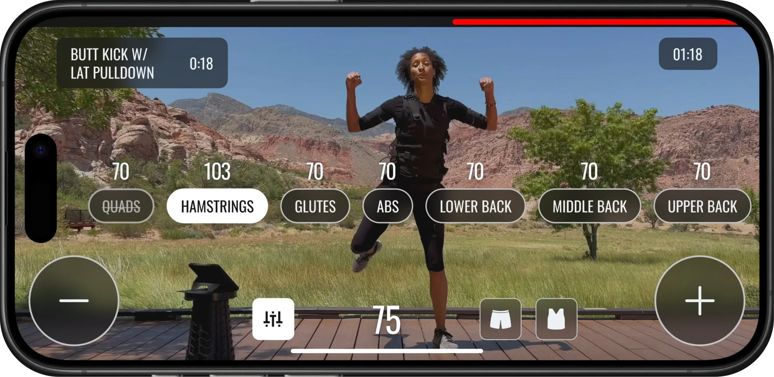
In-Workout Experience: I emphasized one primary action at a time, scaled components responsively, and integrated smooth animations for intensity adjustments. Custom icons simplified key controls, such as mute/unmute, to improve interactions.
Suit Check Screen/Flow
I redesigned the user flow for checking and troubleshooting the Katalyst suit by prioritizing UX over UI.
Instead of a cluttered, single-screen approach, I introduced individual action modals that guide users through resolving specific issues.
This allows users to recheck or deactivate problematic suit components efficiently, reducing confusion and cognitive load.
In-Workout - Experience
The redesigned workout screen emphasizes one main action or feature at a time, ensuring users can stay focused during their session.
Key components are scaled responsively, with smooth animations and a scrollable intensity adjustment for better control.
This design maintains accessibility and ease of interaction, allowing users to intuitively adjust their workout intensity without distraction.
✨ Pride Point #2: UX Solutions - Engineers and stakeholders were challenged yet pleased by my approach to prioritize UX over UI. I focused on creating intuitive interactions that helped users accomplish their goals. After refining the UX, I seamlessly integrated the UI with the legacy tablet app.
This approach earned the CEO’s trust in the product team, leading him to sign off on the designs, which were all rooted in user-centered principles.
Simplified Experience
Instructor Volume Control: The legacy design included unnecessary controls that cluttered the experience. I focused on what users needed most: a straightforward mute/unmute function. I created custom iconography to make this interaction clear and effective, reducing complexity and improving usability.
Less Intrusive Warnings: Legacy designs featured large, disruptive warnings that interrupted the workout experience. I created a new quick-action system, allowing users to handle warnings seamlessly without stopping their workout (paired with Watch OS). This approach kept users engaged and maintained the flow of their session while still addressing critical issues.
High-Fidelity Handoff - Was a Breeze
By this point, I was leading my engineer and myself, as our PM had been pulled in many directions. I coordinated meetings to ensure they were purposeful and timely, and I regularly checked in with developers to avoid disrupting their work, especially given the challenges of working across time zones. Handing off higher-fidelity wireframes was seamless since developers were actively involved from the start through concise, efficient meetings.
Impact:
a. Achieving Long-term Company Goals
We successfully launched Katalyst’s first-ever iOS app, paving the way for new capabilities:
Unlocked Freestyle Workouts, allowing users to take their suit and phone on a run.
Launched the Apple Watch app.
Began testing for integration with Vision Pro.
b. Customer Adoption & Engagement
The new app led to a 30% increase in net new downloads, with an average session length of 15 minutes—equivalent to the length of a standard workout video.
c. Happiness & Memorability
We received positive feedback from both new and existing users, reflecting satisfaction with the app’s streamlined and engaging experience.

Tackling the Redesign: A Bit More of How
The project required a clear strategy to achieve a mobile port while addressing key constraints:
One-Month Sprint: We focused on essential features and prioritized a lean approach, aiming for a smooth and intuitive mobile experience.
Design System Limitations: Without a robust design system, we set clear design parameters for engineers, focusing on cost-effective screen reconfigurations.
Seamless with Tablet: Stakeholders wanted consistency, so we aimed for a native mobile feel that aligned with the existing tablet experience.
We held working sessions to evaluate tablet responsiveness and identify key screens needing full redesigns, such as Authentication, Suit Check, and In-Workout. Lower-impact screens were efficiently ported with minimal adjustments.
Scope & Prioritization
A key aspect was conducting design exercises with user panels, fitness trainers, and the product team to prioritize critical in-workout features. This set the stage for rapid ideation and iteration.
Iterative Design & Feature Assessment
End-to-End User Experience Walkthrough
To set the stage for a responsive and delightful mobile experience, I initiated a design exercise to prioritize critical in-workout features. We gathered insights from a user panel, fitness trainers, and the product team, which informed our decisions and guided ideation and iteration.
Our focus was on the most critical interactions:
Authentication: Onboarding, login, and signup screens required a custom mobile redesign to streamline access.
Workout-Related Screens: We redesigned the Individual Workout, Suit Check, and Main In-Workout experiences to create a seamless, engaging mobile flow.
Fast Follow: For post-launch improvements, we targeted the Activity Screen and other non-critical elements.
Outside of these key areas, the engineering team ported over responsive, lower-priority screens with minimal modifications. I provided detailed design constraints and guidelines to ensure consistency and quality across all screens. Finally, we conducted reviews and made final UI adjustments based on team feedback.
Do:
Prioritize screens and flows requiring a full redesign for a seamless mobile experience.
Set design parameters that allowed engineers to efficiently port simpler screens into the mobile format.
Focus on minimizing costs without sacrificing core functionality.
Attempt to redesign every pixel or modernize the entire experience.
Overload the project by taking on too much, which could risk missing deadlines.
Allow scope creep through extensive redesigns of the design system or CSS.
Don’t:
These principles allowed us to maintain focus on delivering a delightful native mobile experience while ensuring we met the one-month timeline and budget.
Do's and Don’ts: Our North Stars
Through team meetings and design discussions, we established a clear set of guiding principles to keep the project on track while balancing quality and cost:
Main Design Challenge:
Early wireframes revealed that simply translating the tablet-first UI to mobile wouldn’t be enough. Adapting these designs for smaller screens, like the iPhone SE, required a mobile-specific UX approach to create a feature-rich, smooth, and visually engaging experience.
Learning Moment - Low Fi First Always:
Due to the time constraint my initial wireframing were high-fidelity which at this stage taught me a couple things:
Always iterate through new ideas with rough low fidelity - especially when their is a short timeline.
High Fidelity wireframes too early hinders rapid iterations to explore the problem efficiently.
I lost a bit of trust with the CEO early in the process as my early stage iterations were too real too fast. He was a bit distracted by the perfection of the design rather focusing on the overall concepts.
Back to The Drawing Board :
Low Fidelity wireframes revealed that simply translating the tablet-first UI to mobile wouldn’t be enough. Adapting these designs for smaller screens, like the iPhone SE, required a mobile-specific UX approach to create a feature-rich, smooth, and visually engaging experience.
Example: Suit Check Screen
(Legacy Designs - Tablet)

One of many low-fi UI iterations backing up the need for a UX first approach.
Suit Check Redesign: A Clear, Guided Experience
I redesigned the user flow for checking and troubleshooting the Katalyst suit by prioritizing UX over UI.
Instead of a cluttered, single-screen approach, I introduced individual action modals that guide users through resolving specific issues.
This allows users to recheck or deactivate problematic suit components efficiently, reducing confusion and cognitive load.
Reflection - What I think.
Designing Katalyst’s first iOS app in just 1.5 months was a rewarding challenge, requiring a careful balance of strategic UX thinking and stakeholder management. By focusing on essential user interactions and creating a seamless mobile experience, we achieved significant outcomes in user engagement and adoption while staying aligned with business goals. Leading this project highlighted the importance of:
Prioritizing UX-Centric Solutions: Streamlining core interactions helped create an intuitive, enjoyable experience that truly aligned with user needs, rather than simply porting the tablet UI.
Cross-Functional Collaboration: Close coordination with engineers and early stakeholder involvement enabled our team to meet ambitious deadlines, deliver efficiently, and maintain quality.
Navigating Stakeholder Expectations: Clear communication and an adaptive approach helped build trust and consensus across teams, balancing business objectives with user needs.
Always Learning:
This project taught me the value of starting with low-fidelity wireframes, especially on tight timelines. By initially jumping into high-fidelity wireframes, I realized that it hindered rapid iterations and made it harder to explore new ideas. Early on, my high-fidelity designs were polished enough to distract the CEO from the core concepts, shifting focus away from problem-solving. Going forward, I learned that iterating through low-fi concepts first keeps the team aligned on vision without overemphasizing details prematurely.
This experience reinforced my belief in the power of a user-centered, iterative design process to deliver strong results under challenging timelines, while underscoring the importance of staying adaptable and strategic with the level of fidelity in early designs.